App Marketplace: Search Optimization
As the lead designer, I was responsible for ensuring the user could easily find the application that would work with their existing infrastructure. As a site that started with only a dozen apps, it was crucial to make sure the site could expand with the increasing number of apps available. I also maintained brand identity as the company branding evolved over time.
Learn about the Marketplace and how I improved the search experience through user research and testing.
The Marketplace from the Beginning
The App Marketplace is where fintechs and banks can buy and sell financial applications. Built from scratch by the design team, the Marketplace has evolved over time, constantly undergoing improvements.
Originally just a catalog of applications, the Marketplace has expanded to include a user dashboard, a stronger connection to its sister site, the Developer Portal, and a strong user support system.
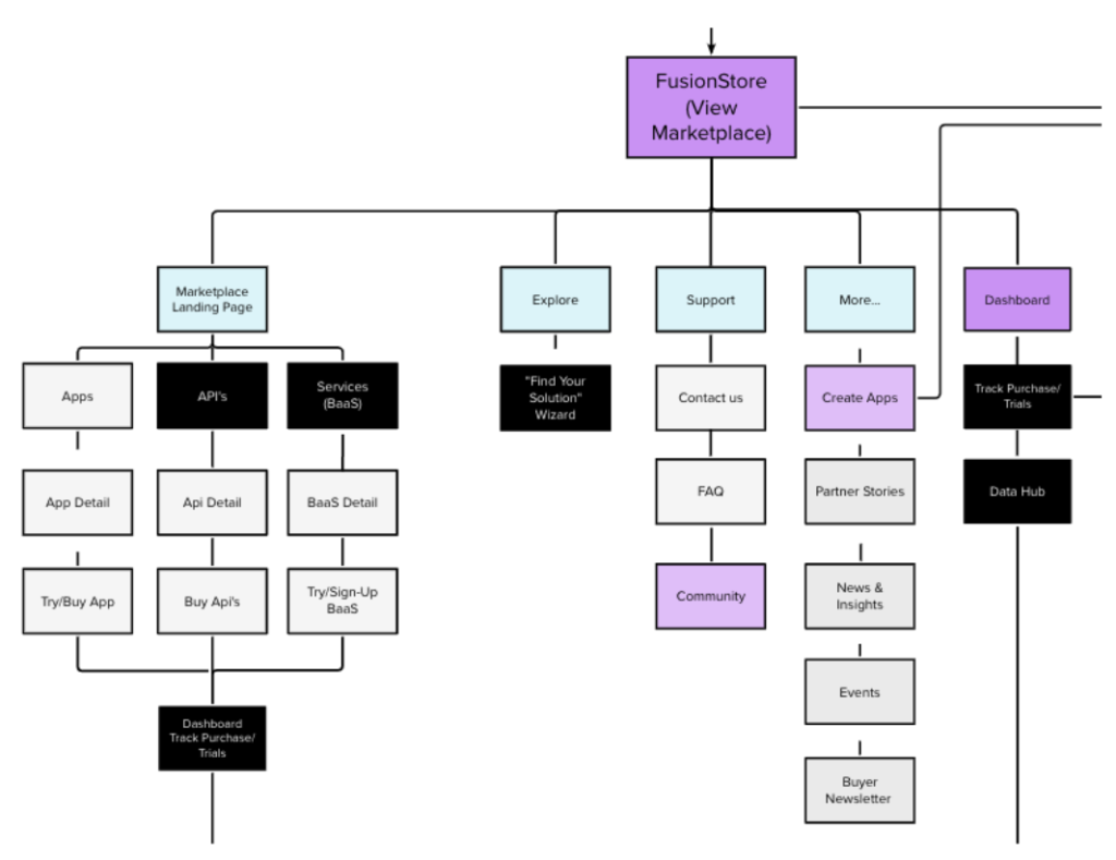
Expanding the Ecosystem
The App Marketplace is a sister site of the Developer Portal, a website where fintechs and banks can build the apps that appear in the Marketplace.
Personas and some basics like navigation structure, as well as look and feel, were pulled from the developer portal.
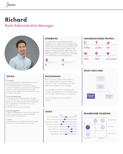
Evolution of the Marketplace

Case Study: Search Improvements
When the site was first designed, the search function was inherited from the Developer Portal. However, this existing search quickly became inadequate for what we wanted the App Marketplace search to be able to achieve. I was the lead designer on this revamp. The main objectives for this initiative were to improve discoverability, enhance usefulness, and follow more standard practices.
Problems to Solve
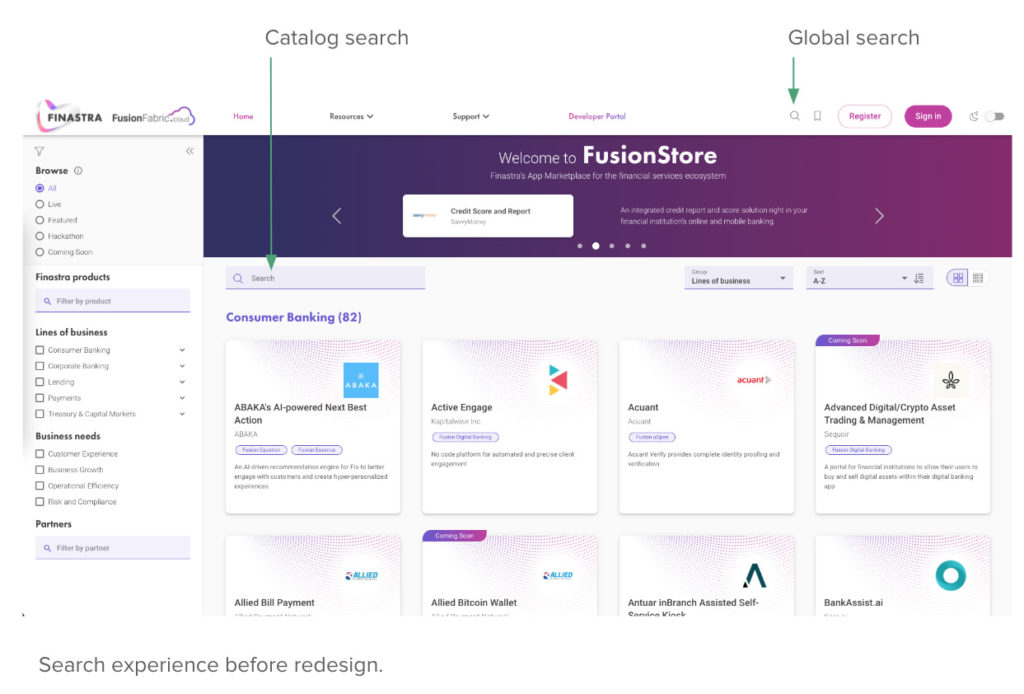
Previously, the Marketplace had multiple search options. This was leading to some confusion as to where the user should be searching.
Additionally, neither search stood out on the page. One of the main goals of this revamp was to make the search clearer to users.
The Global Search, which opens as a full screen search, searches both the Marketplace as well as the Developer Portal, the sister site.
The Catalog Search searches in real time through the catalog. The results only showed exact matches for the search term.
Research & Inspiration
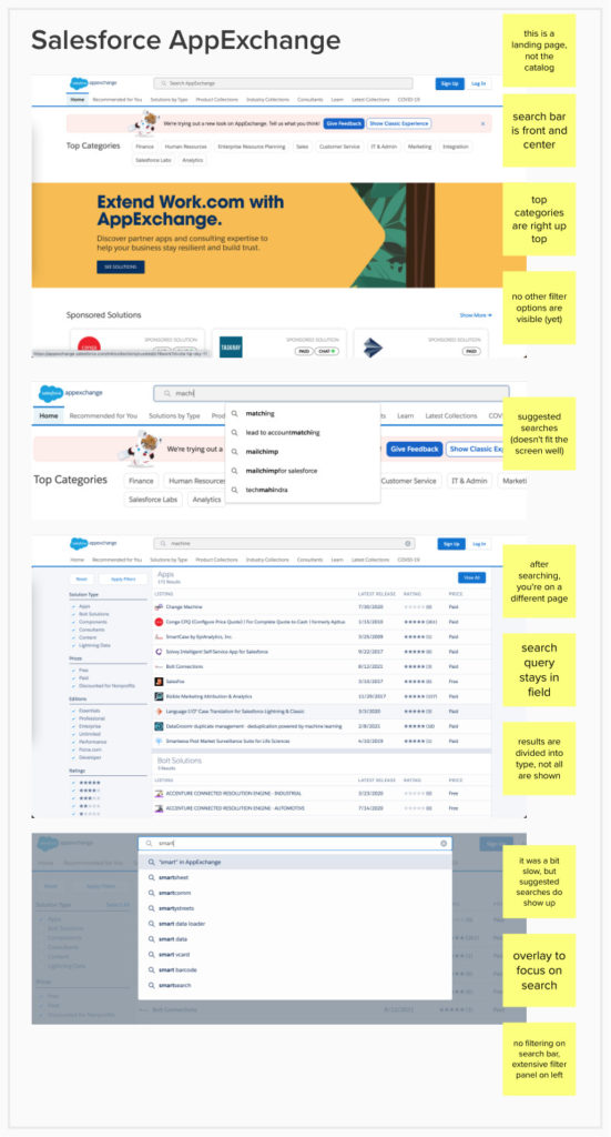
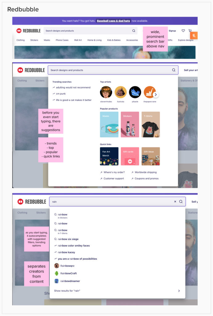
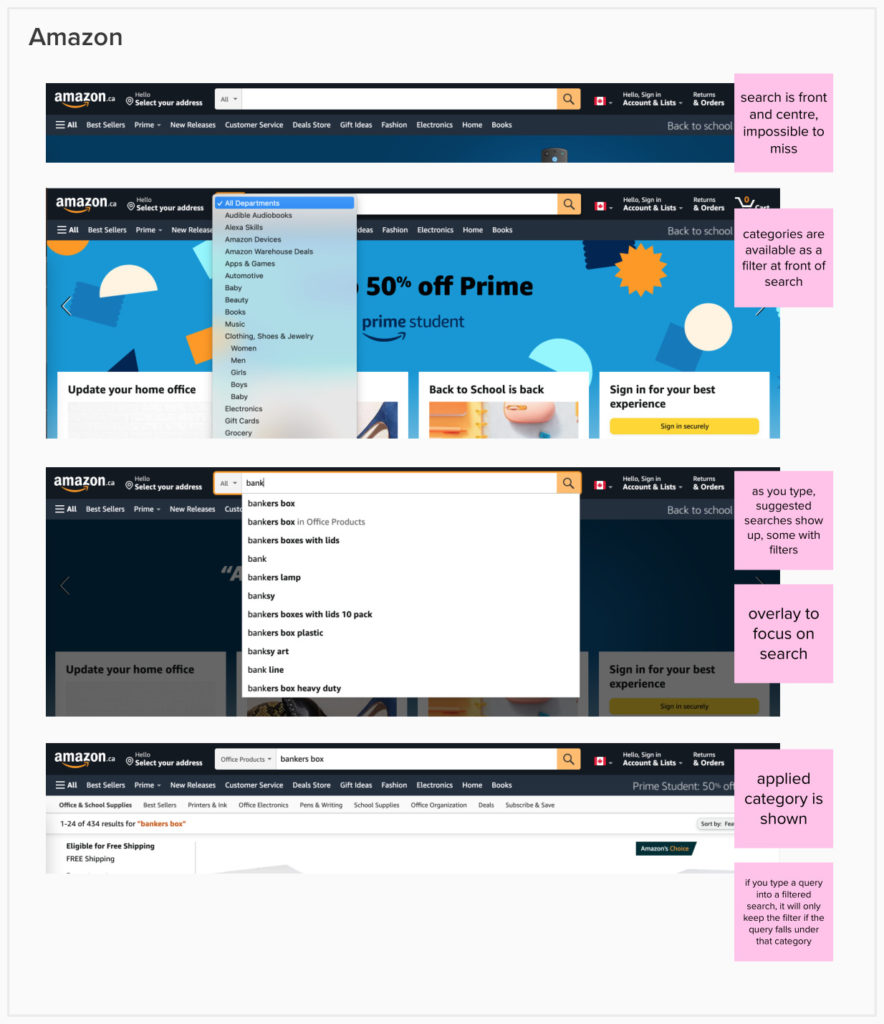
I started by researching common search practices, specifically regarding the size and indicators (icons, buttons, labels).
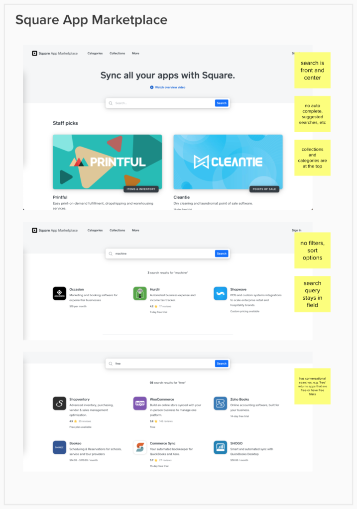
Competitor marketplaces were looked at to compare search capabilities and placement. Filter options were also noted, as the Marketplace filter was also planned to be improved.
Online stores were also looked at for broader inspiration and to see how the search is presented relative to the main navigation.
The lead developer had lots of helpful suggestions on websites to look at, as they had some specific search experiences that had stood out to them.
First Iteration & A/B Testing
Design 1 put the search in the navigation bar and moved other navigation links to a secondary navigation bar. The search dropdown was plain text with small icons.

Design 2 put the search under the banner, closer to the list of apps. The search dropdown took a more visual and condensed approach.


Test Findings
These two designs were tested against each other with the same tasks using UserTesting.com. Over multiple rounds of testing and iterating on designs based on feedback, the following was determined:
- Users preferred the design with search in the navigation (Design 1) as it was front and center, and they were used to seeing a search bar in that location
- Users preferred the more visual search dropdown
- The secondary navigation used in Design 1 made it slightly more difficult for users to find those links
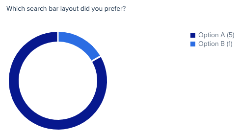

If the opportunity presented itself to retest these designs, there is one thing I would do differently. The test focused on user preference but did not put much weight on more quantitative metrics, like which version users could navigate through quickest or number of clicks necessary. This was a downfall in the analysis of the test findings, which I will be cognizant of in future testings.
Final Version
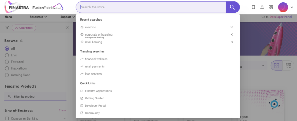
The final version of the design has elements of both initial design proposals. By removing duplicate searches and prioritizing one search, searching is much more accessible and less confusing. This search only searches the Marketplace.
Upon clicking into the search, users are presented with recent searches, trending searches, and popular apps.
As they start typing, suggested searches include recent and trending searches as well as filtered search results.

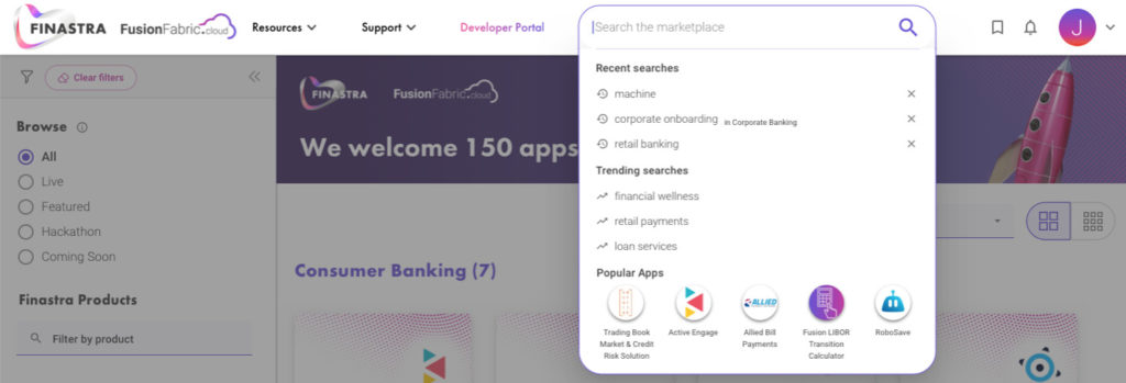

The newly improved search experience reduced user complaints and confusion. Users were able to locate the search function faster than on the previous design. Stakeholders additionally loved the new dropdown that included application logos and recent searches, allowing users to quickly get back to where they had been before. Overall, this search improvement was a great success.
